
The artist Richard Tuttle once wrote, “It is said that color is learned on the mother’s knee.” Yet color—and its character, nature, nuances, and effects—remains complex and mysterious, generating multiple often contradictory theories and responses. For centuries, it has inspired philosophers, writers, scientists, and others to consider such things as its role in visual perception; its relationship to language; and its impact on emotional, psychological, and physical states. Color can have a variety connotations and connections; the color red, for example, has been associated with a wide range of political ideologies, including communism, fascism, and contemporary political parties. Perhaps no one has given the topic more consideration than artists who have engaged color and its effects, as well as its relationships to line, form, and other tones in their work. For many modern and contemporary artists, color functions not as a symbol or representation of something else, but as a subject in itself.
For the exhibition New Acquisitions in Context: Selections from the Department of Drawings and Prints, I wanted to explore some of the ways a group of postwar artists have presented and responded to color. I was interested in how these artists showed that each color is far from uniform or consistent. Viewing these prints together in the installation at The Met, it is clear that each artist engaged color in deeply personal ways that reflected their perspective on what constituted each color.
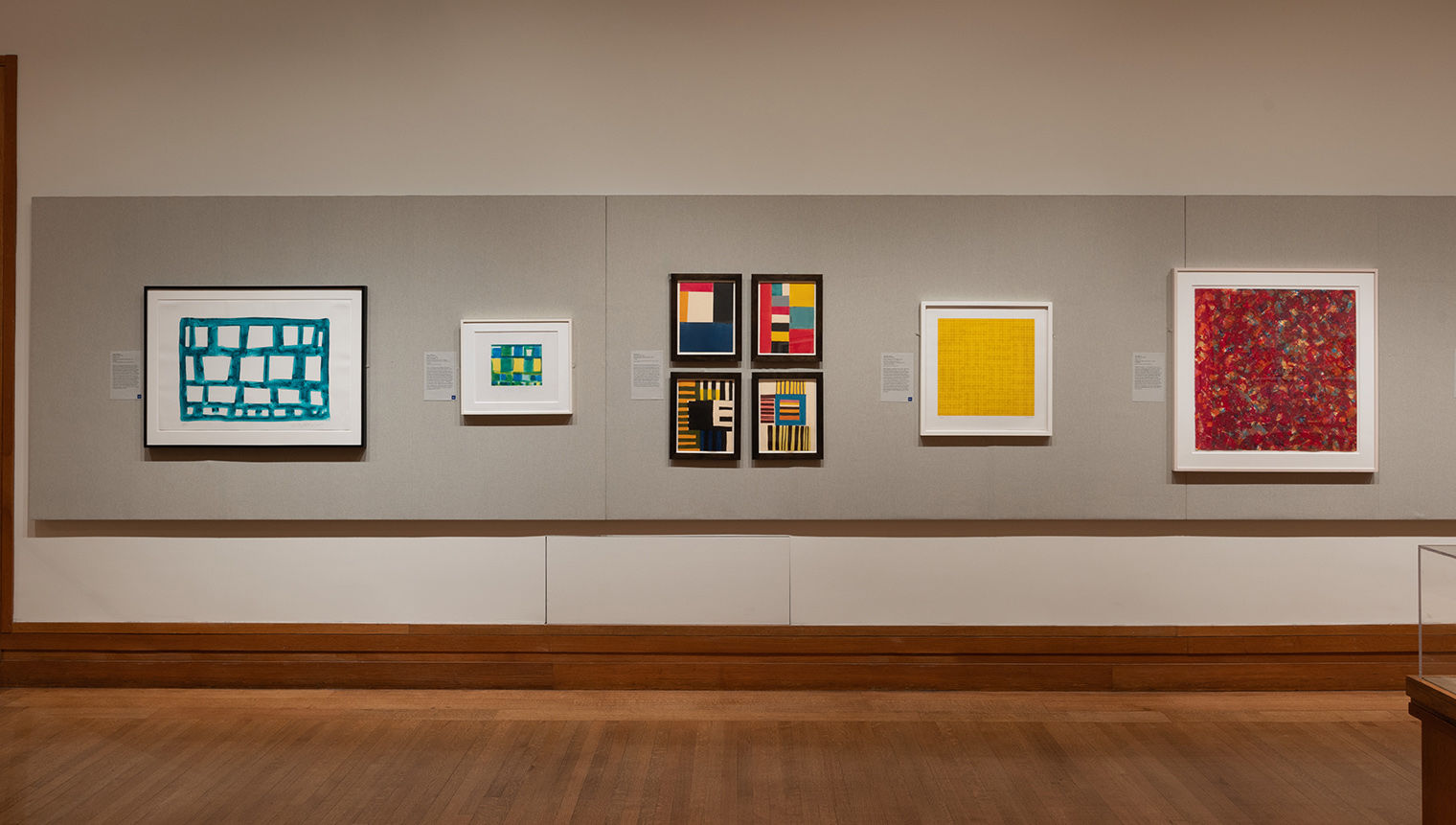
Installation view of New Acquisitions in Context, in Gallery 690
Throughout the twentieth century, several artists, such as Piero Dorazio (1927–2005), praised abstraction as a universal language, one which could provide a purely optical experience. Color was central to Dorazio’s art. Rather than assign it symbolic values, he believed that “color possesses a natural autonomy.” His work, as such, reflected his goal to expand upon its expressive possibilities. During the period in which Lithograph 13 (1961) and j n d (just noticeable difference) (1964) were made, Dorazio focused on the interaction of colored lines with each other and with the negative space of the pictorial surface—as seen here in the relationships both among the colored lines and between these lines and the white of the paper support.
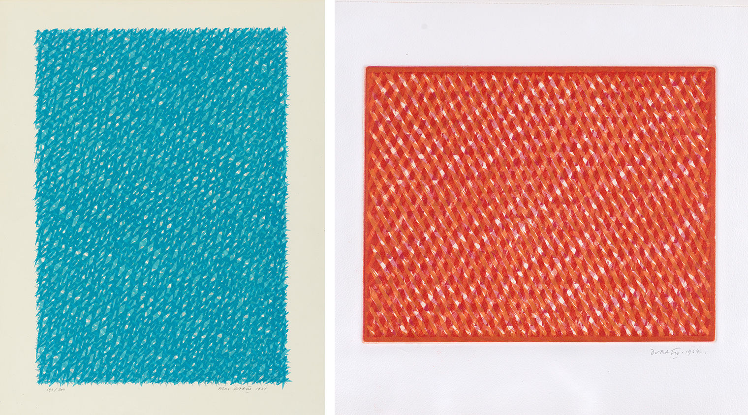
Left: Piero Dorazio (Italian, 1927–2005). Lithograph #13, 1961. Lithograph, 27 3/8 × 20 7/8 in. (69.5 × 53 cm). The Metropolitan Museum of Art, New York, The Elisha Whittelsey Collection, Gift of Thomas M. Folds, 1966 (66.752). © 2023 Artists Rights Society (ARS), New York. Right: Piero Dorazio (Italian, 1927–2005). j n d (Just Noticeable Difference), 1964. Color aquatint, 13 5/8 × 18 9/16 in. (34.6 × 47.1 cm). The Metropolitan Museum of Art, New York, The Elisha Whittelsey Collection, The Elisha Whittelsey Fund, 1965 (65.599). © 2023 Artists Rights Society (ARS), New York
Dorazio’s art was more than a formal exercise, however, as the artist sought to explore color’s effect on visual perception as well as its ability to impact viewers’ “frames of mind, attitudes, and awareness.” In experimental psychology, jnd (just noticeable difference) refers to a concept developed by Ernst Heinrich Weber that concerns the minimum amount something affecting the senses needs to change for a difference to be perceived. Dorazio adopted this theory in his title and evoked this refined sense of perception in the subtle tonal shifts of this shimmering composition. Colored lines run diagonally across the surface, producing a latticelike effect; made with just three colors, the palette expands as lines cross. J n d illustrates how Dorazio, in his quest to “paint light,” synthesized color theories derived from Italian Divisionists and Futurists (such as Giacomo Balla and Gino Severini) with the all-over compositional structure found in the work of New York School artists.
The American artist Sam Gilliam (1933–2022) stated, “I choreograph the color in terms of the way I want it to be seen.” In Phase (1974), a range of vibrant tones and fluid gestures recall drips, splatters, stains, and strokes made in paint and watercolor; here, they work in tandem to transmit an abundance of detail and emotional energy. Thick bands in lush tones of red act as a matrix for the splashes of color interspersed across the surface. Due to their various degrees of translucency, the colors appear to shimmer, mimicking the effect of dappled light and shadows created by the sun. Gilliam creates new tones through the layering of different hues, against which are irregular dabs and skeins. Phase conjures the improvisation and experimentation found in Gilliam’s monumental color-stained canvases known as the drape paintings. However, because it is a screenprint, each color, mark, and gesture had to be carefully planned, and a strict order followed in its creation. In this way, the production of the piece antithetical to the spontaneity it conveys.
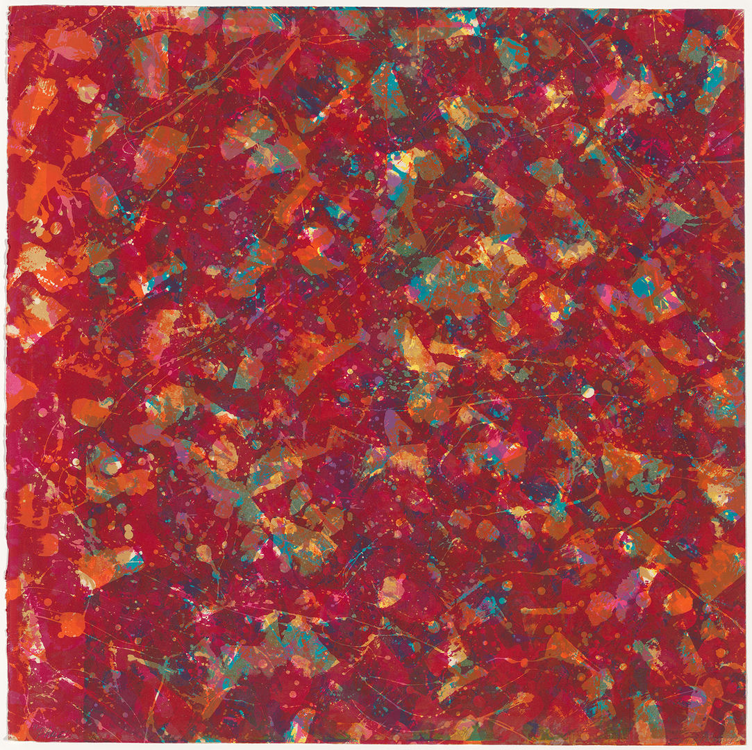
Sam Gilliam (American, 1933–2022). Phase, 1974. Screenprint, 29 1/2 × 29 5/8 in. (74.9 × 75.2 cm). The Metropolitan Museum of Art, New York, Purchase, Hamilton Award, 2018 (2019.97). © Estate of Sam Gilliam / Artists Rights Society (ARS), New York
Like Gilliam, Helen Frankenthaler (1928–2011) is more recognized for her paintings, despite her extensive body of prints made in a variety of techniques. Celebrated for her “soak-stain” paintings in which lush washes of color fill the canvas, she translated this aesthetic, and her mastery of color, into prints such as Yellow Span (1968), her first intaglio work. Rather than incise the printing plate with the sharp point of an etching needle, she used aquatint, a method that allowed her to paint a sugar solution on the plate’s surface to create sheer layers of colors. Yellow Span is dominated by a vibrant yellow that floats atop billowing waves of blue, green, and orange that seem suspended in space. Traces of white from the paper support provide a thin outline for the colored forms, preventing them from bleeding into each other. Orange Downpour (1970) similarly captures the essence of Frankenthaler’s art, namely, the spontaneity and experimentation, the fluidity of forms, and the fusion of color with gesture. A sweep of orange runs nearly the length of the sheet; its irregular shape, blurred edges, and modulated tone evoke watery associations as well as Frankenthaler’s technique of pouring paint. This connection is reinforced by two thin lines of green and purple resembling drips of paint and vertically stacked along the left edge of the sheet.
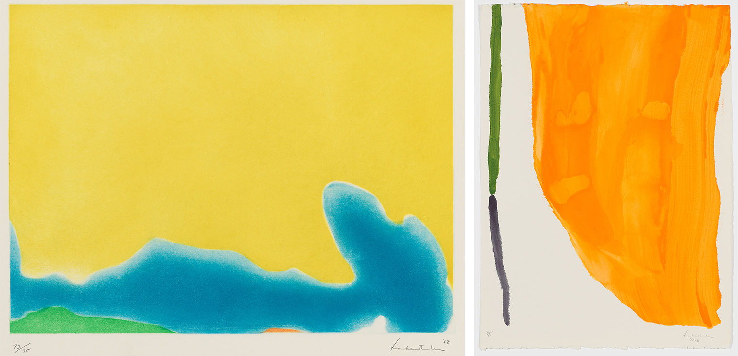
Left: Helen Frankenthaler (American, 1928–2011). Yellow Span, 1968. Sugar-lift aquatint, 19 13/16 x 26 1/8 in. (50.3 x 66.4 cm). The Metropolitan Museum of Art, New York, John B. Turner Fund, 1970 (69.610.1). © 2023 Artists Rights Society (ARS), New York. Right: Helen Frankenthaler (American, 1928–2011). Orange Downpour, 1970. Pochoir, 30 1/2 x 22 inches (77.5 x 55.8 cm). The Metropolitan Museum of Art, New York, John B. Turner Fund, 1971 (1971.589.1). © 2023 Artists Rights Society (ARS), New York
Stanley Whitney (born 1946) has long experimented with color and its effects. In the 1990s, he found inspiration in the art, architecture, and monuments he encountered in Rome and Egypt. As a result, his works became more structured and the forms denser to resemble layers of bricks and other stacked configurations. Whitney begins each composition with the square in the top left corner; from there, he moves across the surface to create rows of horizontal registers, each containing multiple irregularly shaped and sized squares. Yellow Changing (2011) portrays intense sensations of color and movement. The dynamic squares of color arranged both horizontally and vertically can be read autonomously as individual paintings and as an irregularly ordered grid that fills the surface. The title evokes the optical and perceptual shifts that occur when viewing the print.
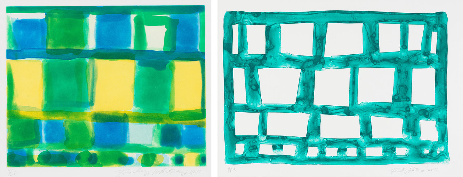
Stanley Whitney (American, born 1946). Yellow Changing, 2011. Aquatint, 15 × 16 in. (38.1 × 40.6 cm). The Metropolitan Museum of Art, New York, John B. Turner Fund, 2022 (2022.381). © Stanley Whitney. Stanley Whitney (American, born 1946). Untitled, 2017. Single color etching, 23 3/4 × 35 1/2 in. (60.3 × 90.2 cm). The Metropolitan Museum of Art, New York, Gift of Craig and Elizabeth Zammiello, 2022 (2022.455). © Stanley Whitney
Whitney has described the profound role color plays in his work, with each tone inspiring the others as well as the form. Despite his association with color, he has stated, “I don’t have a theory about color.... Whatever the color does is fine. I don’t want to have control over color.” Aquatint allows Whitney to create diaphanous washes of color and to endow his palette with a luminosity that recalls stained glass. Whitney explored this connection later in a set of stained-glass windows entitled Dance with Me Henri (2022) made for the Baltimore Museum of Art that refer to Henri Matisse and his stained glass at the Chapelle du Rosaire de Vence. This same effect of capturing light is present in Yellow Changing (2011), where the forms and lines are fluid, blending to create the sensation of multiple pools of colors. Whereas Yellow Changing is dominated by vibrant colors, in this untitled print from 2017, Whitney focuses on the loose, painterly outlines of each square and their relationship, as well as that of the green tone, to the white surface. Both prints exhibit intense sensations of color and movement, as well as the influence of music (in particular jazz), found throughout Whitney’s oeuvre.
For many modern and contemporary artists, color functions not as a symbol or representation of something else, but as a subject in itself.
MAB: (Etching II) 1971 Yellow (2016) by McArthur Binion (born 1946) reflects the artist’s use of repetitive patterns with layers of personal archival materials he terms his “DNA.” Materials such as laser prints from an old address book, his birth certificate, and personal photographs create the surface on which paint or colored inks—often arranged in a grid—rest. These elements record his development as both a person and an artist and act as what Binion terms his “underconscious.” It is against this surface that he adds marks, forms, patterns, and colors. Here, a vivid yellow is in dialogue with the grid that structures this print. Yet the lines are hand drawn, as is the large circle in the center; both elements contrast with the precision, standardization, and aesthetic of detachment characteristic of hard-edged Minimalist art. Binion incorporates autobiographical references in the title and a photographic portrait, which is repeated throughout the composition in horizontal and vertical bands that both recall the seriality of film strips and the grid found throughout the work. Binion evokes connotations and strategies associated with this structure as well as the mechanical reproduction of photography, yet concurrently undermines the detachment such methods and practices imply by inserting his own image.
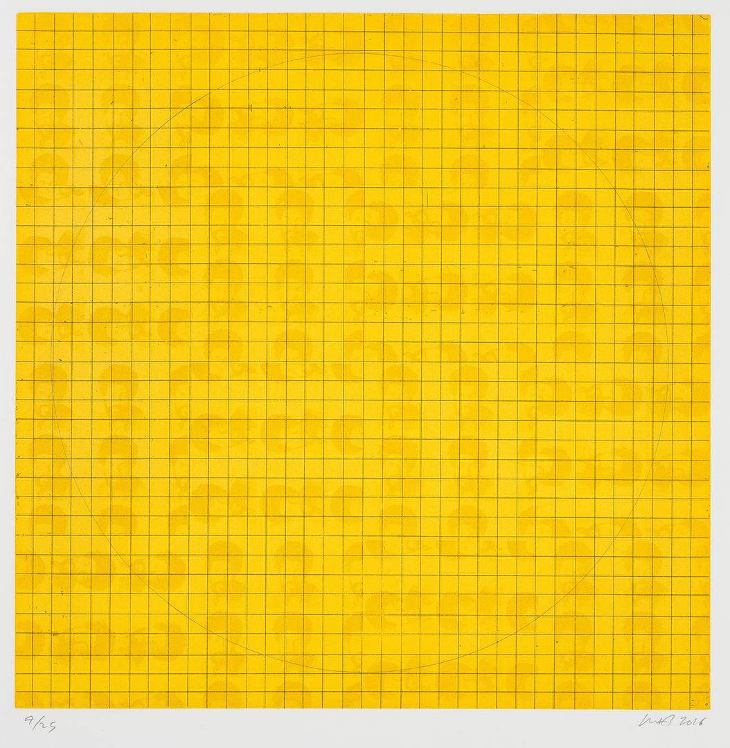
McArthur Binion (American, born 1946). MAB: (Etching II) 1971 Yellow, 2016. Color aquatint with hardground etching, 22 1/2 in. × 22 in. (57.2 × 55.9 cm). The Metropolitan Museum of Art, New York, John B. Turner Fund, 2022 (2022.403).
Color, and its relationships with such things as language, memory, and perception, has played a central role in the work of Richard Tuttle (born 1941), inspiring numerous works of art and writings, including an artist’s book entitled You Never See the Same Color Twice (2017) that followed a seminar he taught on the subject at the Getty Research Institute. Tuttle explores the interaction of tones and colors to create works of subtle contrast and remarkable complexity. Printmaking allows him not only to juxtapose colors but also to layer tones of various intensities to create different combinations and effects. These colors work in tandem with the unconventional methods and materials he uses, creating poetic constructions that highlight modes of perception.
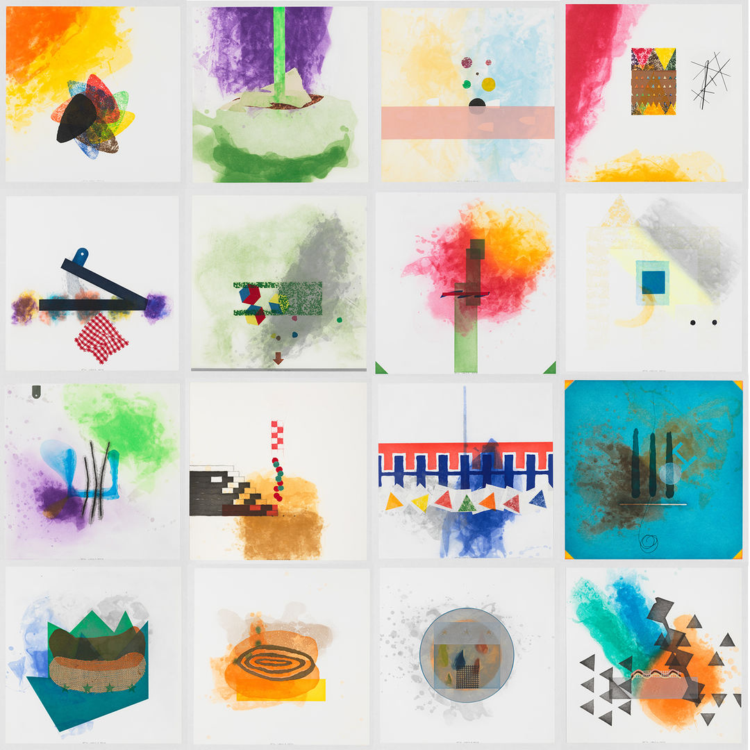
Richard Tuttle (American, 1941). Cloth, 2002–05. Etching with aquatint, spitbite, sugarlift, softground, fabric collé, 16 × 16 in. (40.6 × 40.6 cm). The Metropolitan Museum of Art, New York, Gift of the artist, 2022 (2023.72.1). © Richard Tuttle
One of his most complex works, Cloth (2002–05) consists of sixteen vibrantly colored intaglio prints, each based on a different fabric that Tuttle cut into distinct shapes, manipulated, and placed into contact with the printing plate. These dynamic compositions—with their layered washes of color, patterns, and designs—show Tuttle’s experimentation with technique, modes of perception, and materiality. I am intrigued by the ways these prints contain conflicting elements, such as the play between the sheer and opaque tones and the tactility and patterns of the fabric. Rigid, geometric shapes contrast with amorphous cloud-like formations that seem to float across the surface, often hovering around corners and edges, that seem to reference the natural world. Not only do all the elements within an individual print interact with each other and with the white of the paper, but each piece is also in dialogue with the others in the series. Every print has a subtitle (“Label” and number) that refers to its place in the series. In this way, Tuttle refers to interaction between language’s ability to describe and define (in short, to label) and the eyes’ ability to perceive, both in visual art and in the world itself.
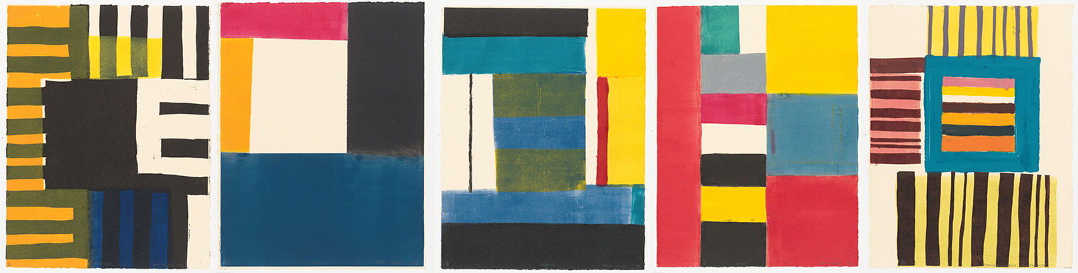
Atta Kwami (Ghanaian, 1956–2021). A suite of five linocuts individually titled: Juapong, Kpetoe, Tsito, Vane, Kpong, 2006. Linocut, 14 x 9 in. (35.5 x 22.9 cm). Janet Lee Kadesky Ruttenberg Fund, in honor of Colta Ives, 2008 (2008.293.1–.5). © 2006 Atta Kwami, courtesy of Estate of Atta Kwami.
Textiles and colored patterns also figure in the work of Atta Kwami (1956–2021). His art has been described as abstract due to its non-naturalistic pictorial language of bold colors and geometric forms, yet he rejected the simplification such a label implied, writing, “Given that there is a very precise, knowable set of resources at the back of it, I would describe [my art] as schematic; like a map, or rather a reaction to or interpretation of a map. It is about ownership, a way to finding myself, where I am.” In these linocuts from 2006, Kwami drew from a variety of sources, including vernacular architecture (such as kiosks, market stalls, and boldly painted homes), textiles, pottery, and wall paintings from Ghana, along with the grids of urban centers encountered in his travels, jazz music, colored patchwork fences, and sign painting. As with Binion, Kwami’s prints evoke strategies of repetition associated with non-objective art and forms such as the grid, yet undermine the detachment and mechanical associations with biographical references. In Kwami’s prints, the blocks of colors are inconsistent; they show variations in tone and intensity, as well as drips and stains from adjacent rectangles. The colors have a visual power, which is heightened by their irregular shapes, placement, and tones. Much like the textiles that inspired him, Kwami here weaves in references to his experiences in specific places, as well as influences that inform both his art and him.
Color contrasts dominate Howard Hodgkin’s (1932–2017) After Degas (1990), whose title, lush strokes, and vibrant colors evoke his memory of encountering work by the French impressionist artist Edgar Degas. For this work, Hodgkin combined intaglio printing with carborundum and hand coloring. The fluidity of the gestural marks conveys a sense of spontaneity and immediacy, effects not generally associated with intaglio printing. Carborundum, a sticky compound that adds surface texture, amplifies this sensation. Despite the autographical associations often projected onto gestural marks, it is not Hodgkin’s touch that is visible in the hand-painted sections but rather that of his printer, Jack Shirreff, who worked under Hodgkin’s close direction to create the vibrant green frame he subsequently painted on each print in the edition. This frame-within-a-frame directs attention inward to broad swaths of orange and red, where the contrasting tones produce a radiance felt throughout the surface.
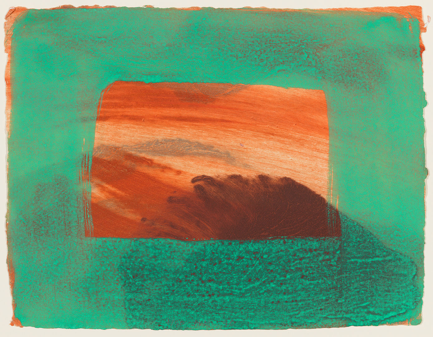
Howard Hodgkin (British, 1932–2017). After Degas, 1990. Intaglio print with carborundum in colors, with hand coloring, 14 15/16 × 17 15/16 in. (37.9 × 45.6 cm). The Metropolitan Museum of Art, New York, Gift of the artist, 1991 (1991.1011). © 2023 Artists Rights Society (ARS), New York / DACS, London
Tunji Adeniyi-Jones (1992) refers to color as “chromatic space.” In this dramatic monotype, he uses a vivid palette, employing similar tones for the figures and the background to create a dynamic sense of motion running through the composition. Shimmering Duet (Red Pink) (2022) features two elongated figures whose bodies—composed of sinuous, undulating lines and curving forms—appear to mirror each other until differences between the forms become apparent. They are shown against an ornate background, its pattern evoking lush foliage or decorative wallpaper. His works reflect what he describes as a philosophy of “cultural addition, combination, and collaboration.” In his art, he fuses elements of abstraction and figuration, drawing on myriad sources that include West African art and textiles; modern and contemporary European, American, and African art; illuminated manuscripts; West African mythology and literature; and his experiences in Great Britain, the United States, and Nigeria. Adeniyi-Jones is interested in the multiple ways in which colors can function based on the manner in which they are encountered (contrasting direct versus peripheral encounters, for instance), as well as the various emotions experienced through these different modes of perception.
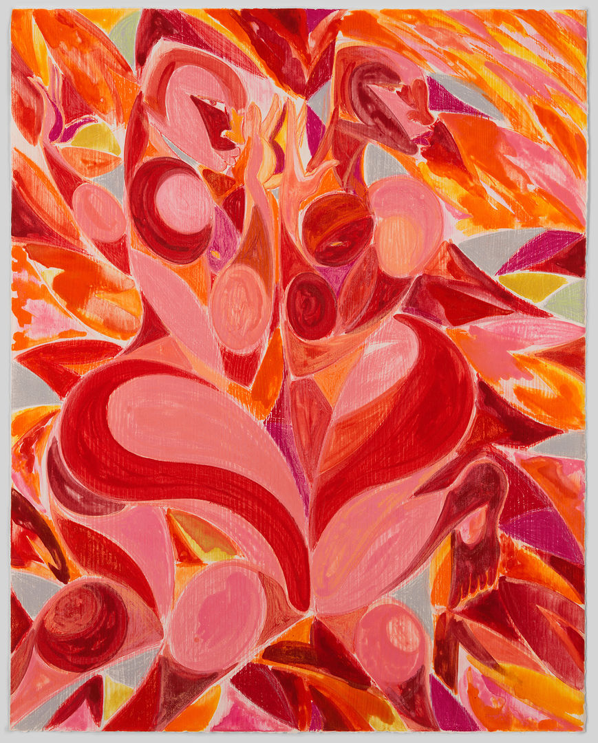
Tunji Adeniyi-Jones (British, 1992). Shimmering Duet (Red Pink), 2022. Monotype, 49 7/8 × 39 5/8 in. (126.7 × 100.6 cm). The Metropolitan Museum of Art, New York, Gift of The Ellsworth Foundation, 2023 (2023.175). © Adeniyi-Jones Studio LLC
This selection of works provides just some examples of the vital role color has played, and continues to play, in art. These artists—with their diverse approaches, philosophies, techniques, and styles—show that color, while perceived as something standard and basic is, in fact, complex and deeply individual. Rather than being universal and constant, perceptions and notions of each color are subjective and inconsistent, based on, and continually shifting in response to, personal experiences; changes in vision; and other variables, such as light conditions or proximity to other colors, that affect our encounters with images. The challenge of defining a color (such as yellow) and then choosing a specific shade to represent it—not to mention the difficulty of translating such thoughts related to visual perception into language—have led many to reject the possibility of developing a definitive theory of color. Perhaps it is more productive to recognize the fundamental individuality of perception and the vast possibilities that come with these differences. As Ludwig Wittgenstein asked, “Can’t we imagine certain people having a different geometry of color than we do?”


